When’s the last time you took a drive through a small town? Lately, they’re starting to feel like ghost-towns: abandoned storefronts, closed shops, and no hustle or bustle. It’s an unfortunate product of e-commerce and behemoth companies.
Small businesses have an anemic survival rate. Only half will remain open past five years, and that number doesn’t stop shrinking. Less than a third continue after a decade.
Mom ‘n’ pops can’t compete on the same scale as a Walmart of Amazon. Among their strongest deficiencies is advertising. Most local shops don’t have a marketing department; they’re an anomaly if they even have social media.
All of these dilapidated, closed shops suffer from the same trend. They lack outdoor advertising services. Here’s how to catch the eye of potential customers.
Legibility is Important
What is a sign? It’s something that can be easily read. It has to convey a message and to do it concisely.
Most of the people that pass your shop will be zooming by in a car. It’s the responsibility of your sign to tell them what your business is and what it’s about. That’s a tough job (especially for an inanimate object) if they’re going 55 miles an hour on average.
Because people speed by your shop, your sign needs to be limited. It shouldn’t be written in full sentences. It needs to have everything (your store’s name and what you do) immediately represented.
Most importantly: use a legible font. There’s nothing more irritating than trying to read a sign that’s in swirly, whimsical cursive. It doesn’t have to be Arial or Times New Roman, but try to avoid over-styling.
Picking Colors for Outdoor Advertising Signs
Color is a subtlety of good design. It has a lot of impact on emotion and readability.
Viewing too strong of a color can elicit subconscious psychological reactions. Avoid harsh colors in your sign like blood red. Instead, pick a peaceful and inviting color like tulip yellow.
Yellow and bright colors generally have a highlighter effect. They’re easily seen and picked out – a perfect combo for advertising.
Depending on your color choice, pick the right foreground color for your font. Black font goes well against lighter backgrounds. Dark backgrounds should be coupled with light lettering.
Add Your Logo
A logo symbolizes who you are and what you do. If you’re a cafe, your symbol wouldn’t be a football. It’d be a latte or a cup of steaming coffee.
This is perfect for advertising quickly. Use your logo on your sign as an opportunity to say what you’re all about. Remember the ol’ advertising adage, “a picture’s worth a thousand words.”
It says it all. And it says it quickly.
When you visualize companies, you think of their logo first; McDonald’s and their arches or Nike and their swoosh-symbol.
Traffic: “Let’s Stop There”
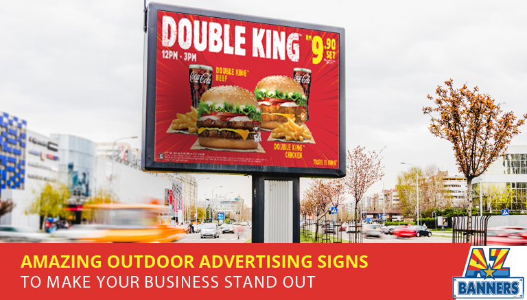
Outdoor advertising signs are a cornerstone of marketing. And for small businesses without marketing teams, it’s sometimes the only ad they can afford.
Make a sign that’s legible. It needs to be concise with clear font. It should have a complementary color scheme and your logo, too.
Sign away your time and check out some more posts about signs.
_________________________________________________
Ready to make your business stand out with outdoor banners or signs? Call the experts at AZ Banners today at 480-718-0544 to discuss your project. Our knowledgeable staff can help you through the process and provide speedy turnaround!
Read related articles:
7 Tips for Creating Eye-Catching Construction Banners and Signage
5 Tips for Creating Outdoor Banners for Car Dealerships
How to Grow Your Congregation With Outdoor Church Banners
Blog Image Attribution: Frame photo created by freepik – www.freepik.com


