
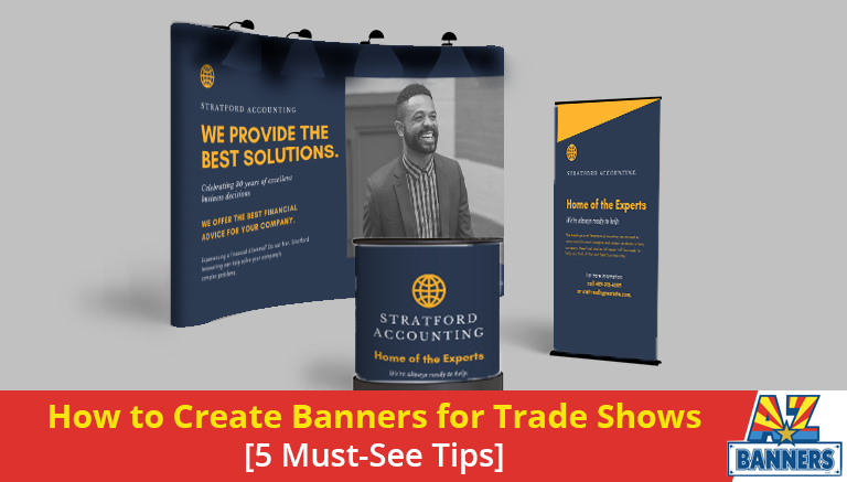
Trade shows present an amazing opportunity for your company to stand out, but only if you can successfully compete amongst all the other advertising noise. For this purpose, banners for trade shows truly shine. They can be spotted from across a crowded convention hall floor, and they can also reinforce the messages being sent by attendee staff and their more subtle trade show marketing tools.
Of course, having your banner advertising work the way you want it to means understanding what it takes to design a banner graphic that is both effective and memorable. Not all of the design tips are obvious, either, since even some of the biggest companies in the world can get it wrong.
So learn a thing or two about making the best impression possible at a trade show with these five banner design tips:
Speak Visually to Be Understood
Many marketers fail to consider their designs as a whole piece of communication. Instead, they will focus on the text as one part, and maybe a photo to complement it.
In reality, people take in the entirety of a trade show banners visually and all at once, including all of its colors, text, shapes, photos and other elements. Even the spacing around the border can tell a subtle story in our minds, so consider all factors put together, not separately. Having a fresh set of eyes evaluate the design before it is finalized always helps in this capacity.
Make Your Artwork Pop!
Your goal should be to grab attention while still communicating brand values in a dignified way. Possibilities to encourage views include:
- Great use of contrasting or complementary colors
- An intriguing turn of phrase or unexpected use of a familiar graphic
- Bold art direction, such as a highly stylized cartoon drawing
- High-quality photo prints or graphic reproductions
- Unique shapes or clever use of contextual placement
- Input of any sort from a professional designer
Avoid Busy Backgrounds
The background of your banner should be simple and not distracting. Think of it as a plate that you put gourmet food on: it can be colorful or pretty in its own right, but should never upstage what should be the main elements.
Less Is More with Text
If people wanted to read a novel at a trade show, they would bring a paperback with them. Do not force them to digest large chunks of text on your banner. Most people will not even bother.
To solve this issue, try to condense text into two to three discrete “chunks” that can be read in just a one or two seconds each. If your message cannot fit within these limited spaces, then consider how it can be reworded or how visual elements can help tell part of the story.
Don’t Forget Your Contact Info!
Whether you want an email, a website visit, a Facebook like or a phone call, always ensure that your audience has the opportunity to touch base with you by including contact information on your banner. Otherwise, the effectiveness of your design could matter for naught as they quickly forget about your company in light of the other activity going on nearby.
To ensure that your trade show banners can accomplish everything you wanted them to, get them printed at AZ Banners. We provide design consulting when strategic improvements are needed, and we also offer only the highest quality materials and inks to carry your message on them.
All of our banners print fast and ship anywhere in the U.S., so contact our Phoenix trade show printing company today to get started.
_________________________________________________
Contact the custom banner experts at AZ Banners to get started today! Request a quote online or call 480-718-0544 now!
Read related articles:
- 3 Ways Cheap Personalized Banners Stretch Your Ad Budget
- How to Use Sports Banners and Signs to Stand Out at Games
- Standard Vinyl Banner Sizes for Your Phoenix Marketing Needs